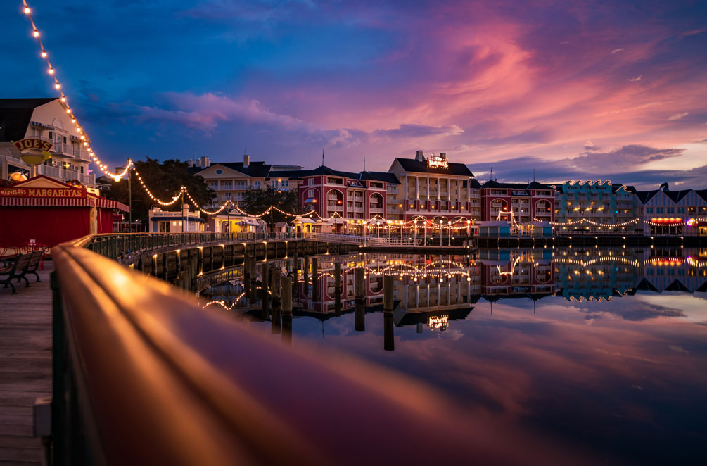

BoardWalk Inn’s newly-reimagined guest rooms have debuted, with a fresh look as part of a bigger-picture overhaul of the resort. This review share photos, video, and our thoughts on Walt Disney World’s redone rooms, how they compare to the old ones, and other recent redesigns to Deluxe Resorts.
Let’s start by quickly recapping what’s happening with Disney’s BoardWalk Inn. Last year, Walt Disney World announced that they’d be making “a seaside splash at Disney’s BoardWalk!” The multi-year project would see Walt Disney World reimagining elements of the beloved turn-of-the-century promenade and inside the Deluxe Resort, with a new lobby design, nearby coffee bar, delectable dining options, refreshed guest rooms, and other special touches.
The most significant and controversial changes have been on the dining front. We’re not talking major controversies, but no one really seems enamored with the changes to Belle Vue Lounge or the look of Carousel Coffee or the menu of BoardWalk Deli. Then there’s what’s replacing ESPN Club–the storybook sweet treats and dreamy desserts served up at The Cake Bake Shop by Gwendolyn Rogers, a new table service restaurant and bakery that should open in 2024…or maybe 2025 at its current pace.
Honestly, I don’t think most guests care about any of this. Yeah, some questionable furniture choices were made at Belle Vue Lounge, the generically modern interior design of Carousel Coffee is not great, and the menu of BoardWalk Deli has annoyed a lot of fans from the Garden State. (See What New Walt Disney World Resort Designs Get Right & Wrong for more on this.)
But for the most part, these aren’t major offenses. The vast majority of Walt Disney World guests won’t notice any incongruities (to lump everything together). For our part, we diehard Walt Disney World fans should probably be happy they didn’t get heavy-handed with a needless modernization of the lobby. Our beloved children of the corn chairs still flank the fireplace, and that right there is a victory!
With that said, the reimagining of the guest rooms at Disney’s BoardWalk Inn has been much more polarizing among Walt Disney World fans. Let’s take a look at the good and bad…
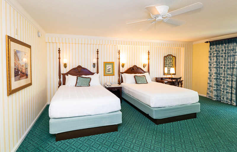

Before we get started, above and below are photos of the old rooms for the sake of comparison and context.
In some ways, this room is clearly dated. I’m not going to deny that. With that said, I think some details like the bed frames, wallpaper, paintings, lamp, and furniture all were oozing charm and whimsy, and truly felt like something out of turn-of-the-century Atlantic City. These rooms were not perfect, but they were perfectly on-theme.
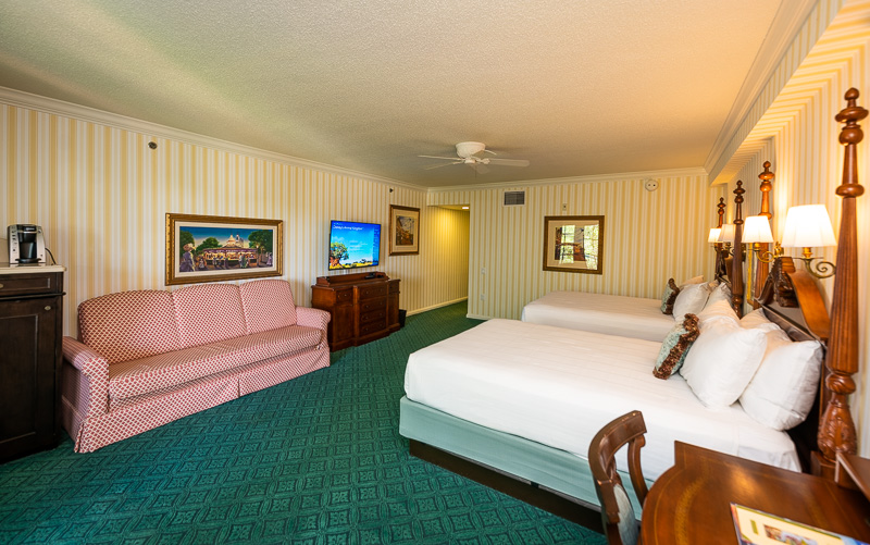

These wide views don’t do the old room complete justice, as so much of the personality of BoardWalk Inn’s rooms was in the details. If we could, we would’ve bought that carousel art over the couch, the desk chair, and the Victorian Minnie Mouse lamp.
We have a lot of nostalgia for Disney’s BoardWalk Inn, and there were a few years when it was where we stayed more than anywhere else. I can also be objective, and look at those photos and think they probably needed updates. The carpet, for one. A new couch and elevated bed frames with storage underneath, among other things. (The old photos are of an ADA room, if you’re wondering why the symmetry is a bit off.)
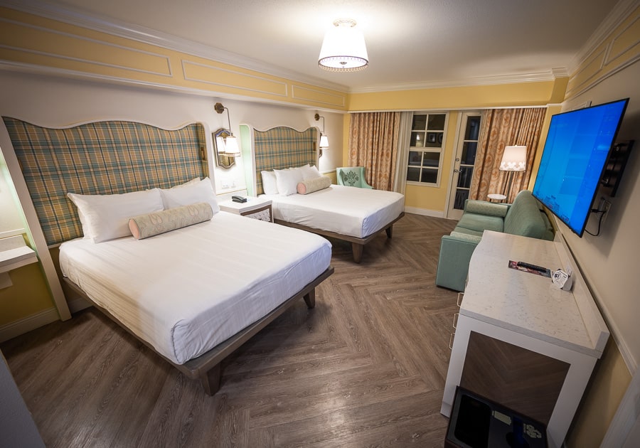

All of the photos that follow are of the new rooms at Disney’s BoardWalk Inn.
Since the heart and soul of the old rooms were in the details, I think it probably makes sense to start there. As your first impression and final verdict on the rooms might differ based on consideration of the custom-made fixtures and furnishings.
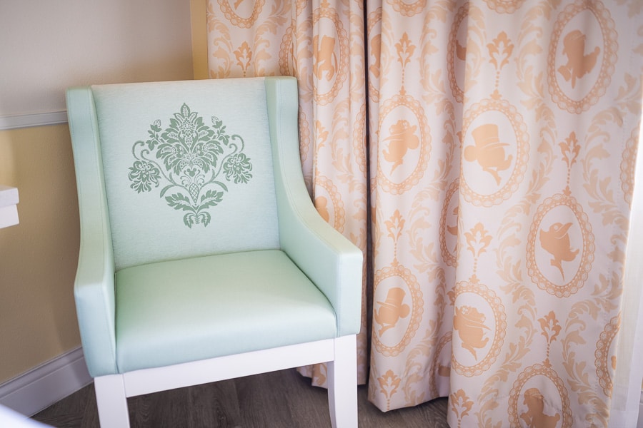

Right off the bat, I want to start out with two of our absolute favorite things about the new rooms at Disney’s BoardWalk Inn–this chair and the curtains.
I liked the old curtains. They were green and white and featured the hotel itself. Admittedly, when paired with the carpet, they also gave me an odd country club vibe. Not really sure why. In any case, I think this curtain with Victorian character silhouettes is pitch-perfect. Also, note the hidden Mickey in the center of the chair.
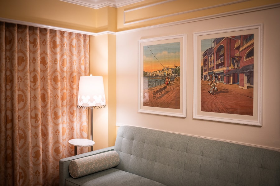

In fact, there are lots of hidden and not-so-hidden Mickeys throughout the room. They’re also in the lampshade, and the pillows on the couch.
The quality on all of the furnishings and fixtures is high. The furniture is heavy and substantial, feeling both high quality and durable. Same goes for the pillows, which are thick and substantial. All of this is worth noting because we’ve seen the opposite in some recent refurbishments, and the rooms have shown wear and tear way quicker than they should.
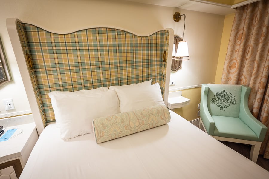

There are similarly patterned pillows on the bed that, when paired with the bed frames, provide a bit of a punch. Still not on par with a proper bed runner, but there’s no getting those back.
Speaking of those bed frames, they’re interesting. The wingback headboard is upholstered in teal and gold plaid, and has a contour on the top to give it a bit of flair. It’s a sharp look, but one I’d describe as chic and stately rather than charming.
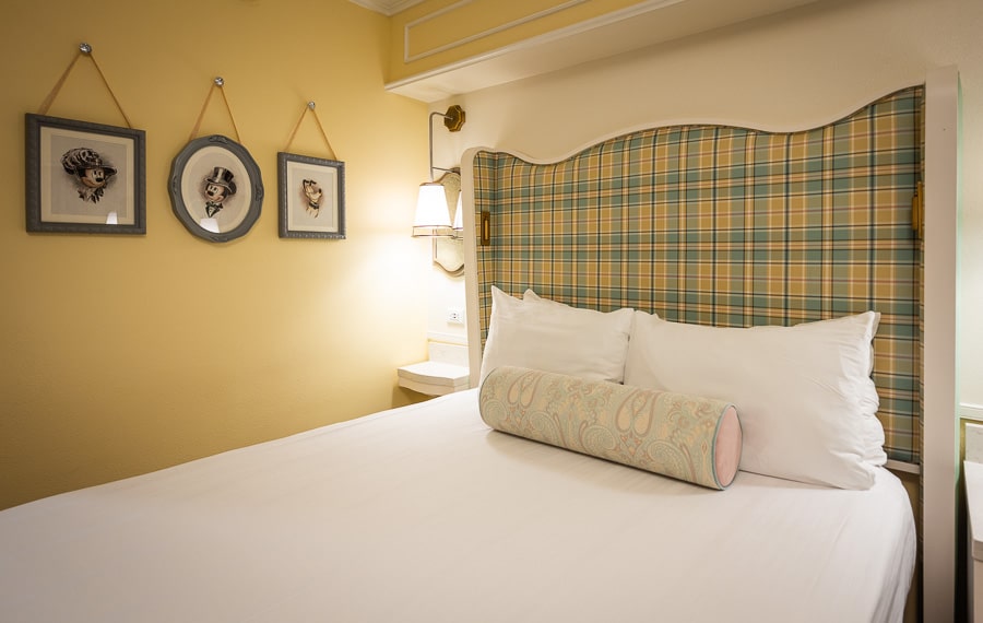

Nevertheless, the headboards are nice. They have built-in reading lights and the side stands with wall chargers for your phone and other devices are also a nice touch and overdue modernization.
In general, there’s a nice heft to the end tables, chair, lamps, and other furniture throughout the room. The cabinet doors and drawers move smoothly, and simply feels higher end. These little upgrades are not apparent from photos, but imbue the room with a greater sense of luxury than its predecessor, which definitely had a more vintage Victorian vibe.
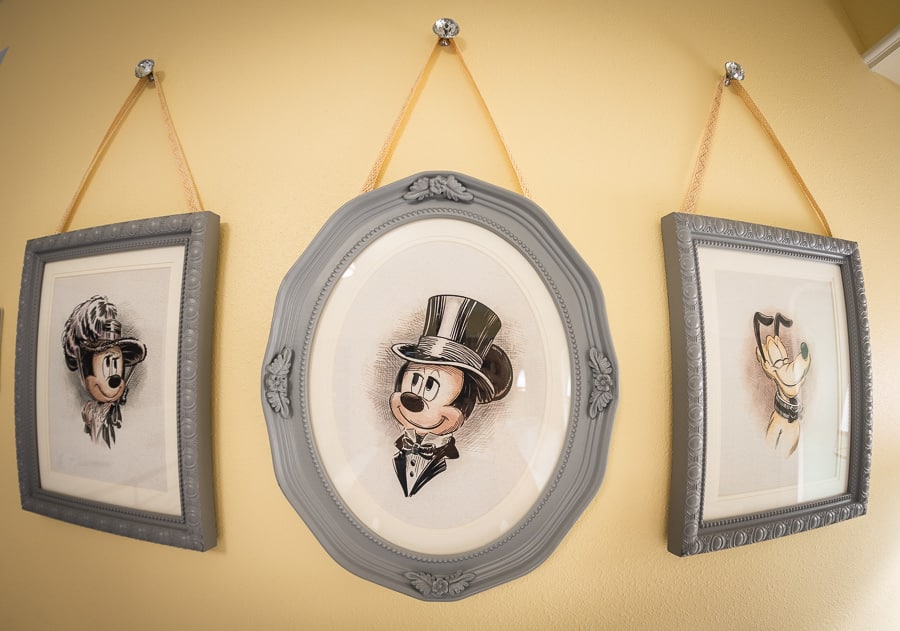

Speaking of which, I really like the Victorian portraits of Minnie, Mickey, and Pluto by the bed.
These are beautifully-done, wholesome, and on-theme. I don’t personally prefer it to the BoardWalk scenes here before, but I realize not everything is catering to my personal tastes or memories. Zero complaints about these–they’re nice.
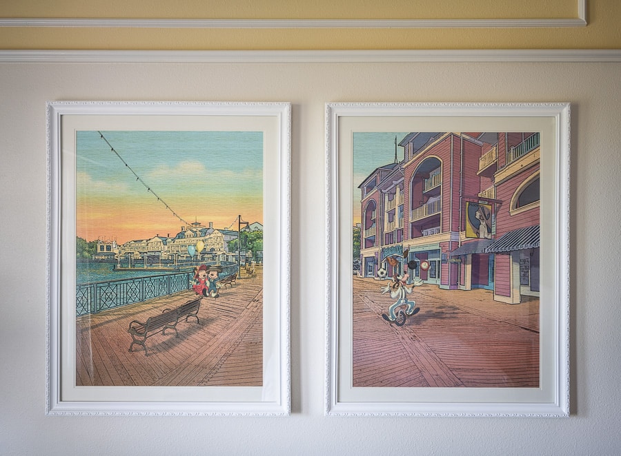

That’s more or less my take on all of the artwork in the new rooms at Disney’s BoardWalk Inn.
Personally, I do not prefer this to the ‘scenes from the BoardWalk’ paintings in the old rooms. But I recognize that change is inevitable.
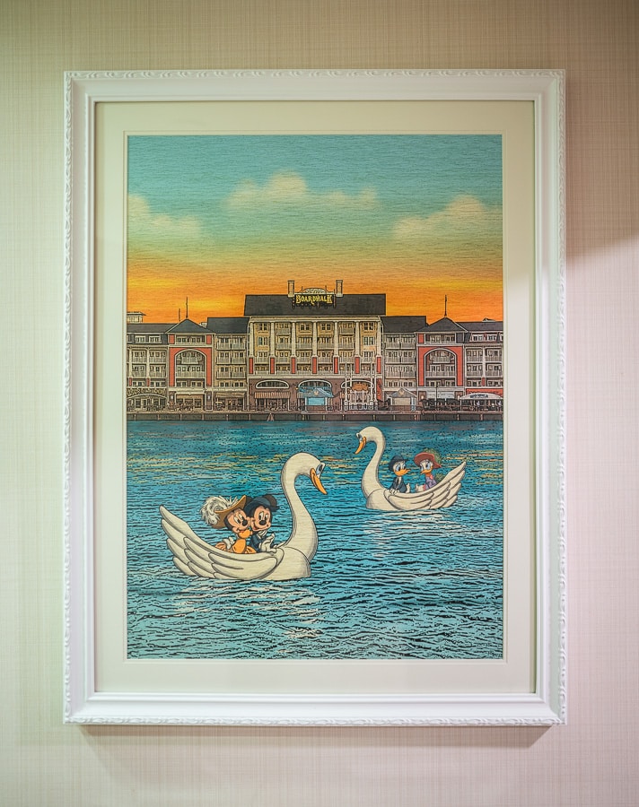

Had this room refurbishment happened ~5 years ago, we would’ve gotten generic, semi-abstract, washed-out photos of a random amusement park. That’s not me guessing–room refurbishments from 5-7 years ago had that type of art.
This is a night-and-day improvement over that, and on par with the old artwork in the BoardWalk rooms from a quality and thematic perspective. I would even imagine that some Disney fans will prefer this art, along with most casual guests.
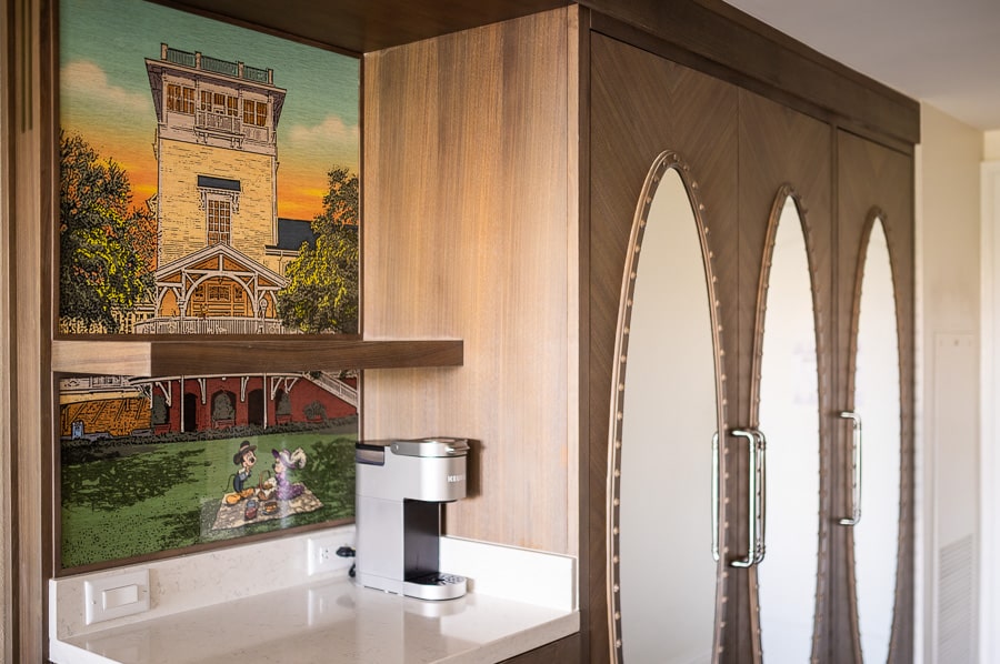

There are also more pieces of art in the new rooms, thanks to the addition of the above piece above the beverage center and behind the single-cup Keurig. (Not pictured is the beverage cooler below this.)
Suffice to say, the art in the new rooms is a big win. It’s pretty, charming, and perfectly on-theme for turn-of-the-century Atlantic City!
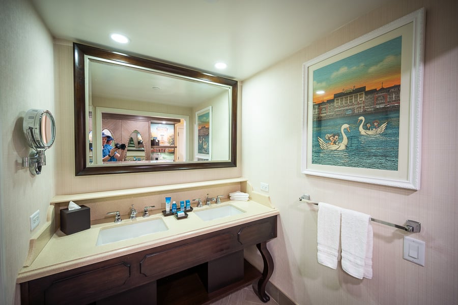

The artwork continues in the bathroom, which has also been refreshed.
These have been updated, but notably, there was no wholesale modernization. The mirror, sinks, and vanity are all the same as before. Most of the newer bathrooms have larger sinks, more storage space, and Batman searchlight-grade lighting for illuminating every single pore on your face.
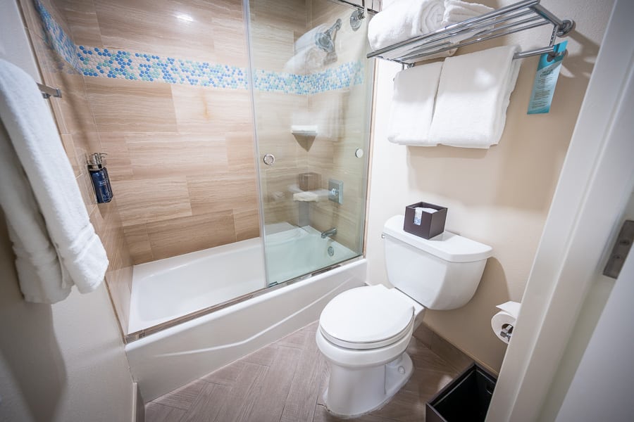

BoardWalk also got the half-measure shower/bathtub redo, rather than a full walkin. For those who don’t keep up with room renovations at Walt Disney World, this means a glass door replaced a plastic curtain. (Many parents with small children dislike the glass door because it makes bathing kids difficult and uncomfortable.)
I don’t think anything else in here changed during this reimagining–these bathrooms were redone during the last soft goods refurbishment, if I recall correctly. I don’t have a strong opinion on these one way or the other, but they do remind me of the era when Walt Disney World couldn’t balance modern styles with themed design. They’ve come a long way since.
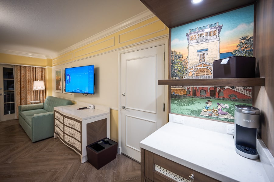

My biggest quibble with the new rooms at the BoardWalk Inn are that certain elements or pieces feel slightly off.
In particular, both the dresser under the television and the end table between the bed just looks like a little out of place. Objectively, these are both nicer than what was there before. But they definitely don’t look Victorian…or like anything, really.
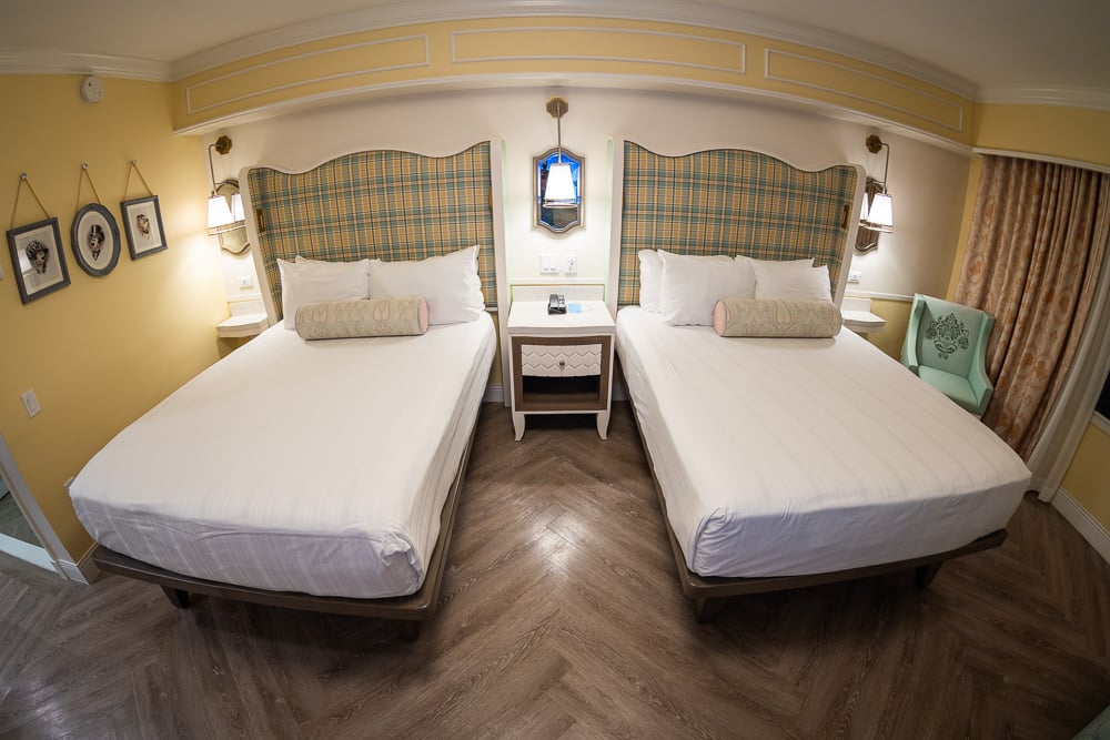

As another example, the herringbone plank flooring doesn’t exactly strike me as Victorian.
I get that Walt Disney World wants to move away from carpet to make these rooms easier to clean (under the guise of hygiene), but they’ve used very similar plank flooring in so many recent room redesigns. It may not look tremendously out of place to guests who are used to seeing it, but it’s not on-theme. It’s also going to age poorly once the look is no longer in style.
(Above is a video tour of the new hotel rooms at Disney’s BoardWalk Inn.)
Area rugs under the beds would be a great compromise, giving the rooms both a bit more luxury and the potential for another themed element adding personality. We know this formula works, as it’s exactly what Walt Disney World did with the new rooms at Grand Floridian.
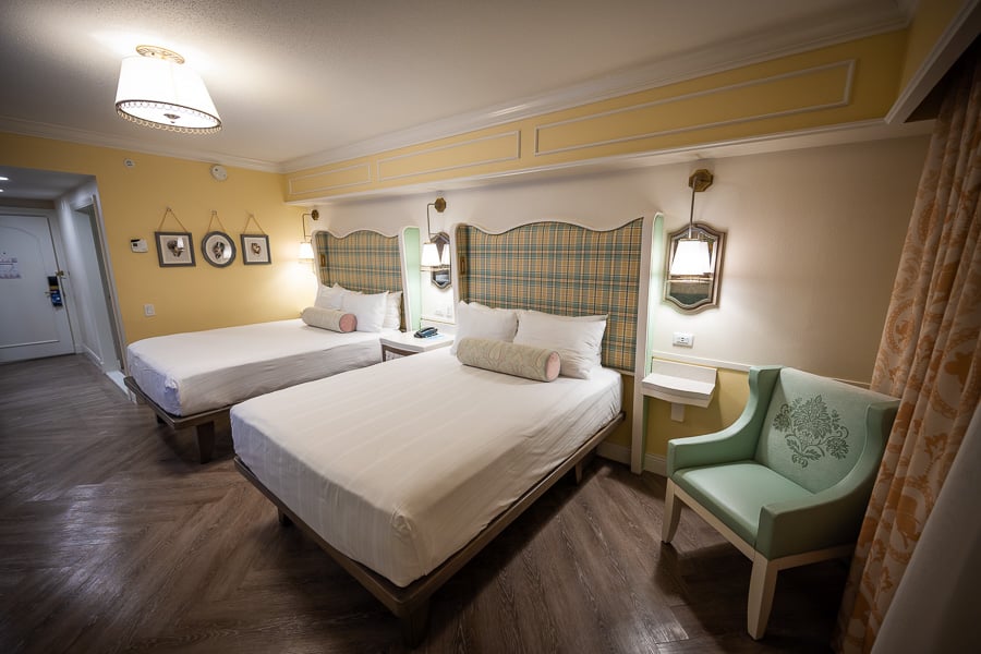

In the grand scheme of things, this is not really a big deal. Don’t let perfect be the enemy of good and all that. This is a room review, though, so it’s only fair to…review the room. I’m just saying that if I were an average guest, those little things wouldn’t be make or break for me.
I also think it’s fair to point out that every iteration of Walt Disney World hotel guest rooms have contained thematic inconsistencies. We just paper over those in our minds. Most of us also use what we experienced first as a baseline of the thematically ‘ideal’ guest room. I’d hazard a guess that there are some people who stayed in the last generation of Villas at BoardWalk or Beach Club who think those are perfect. (They aren’t. They sucked.)
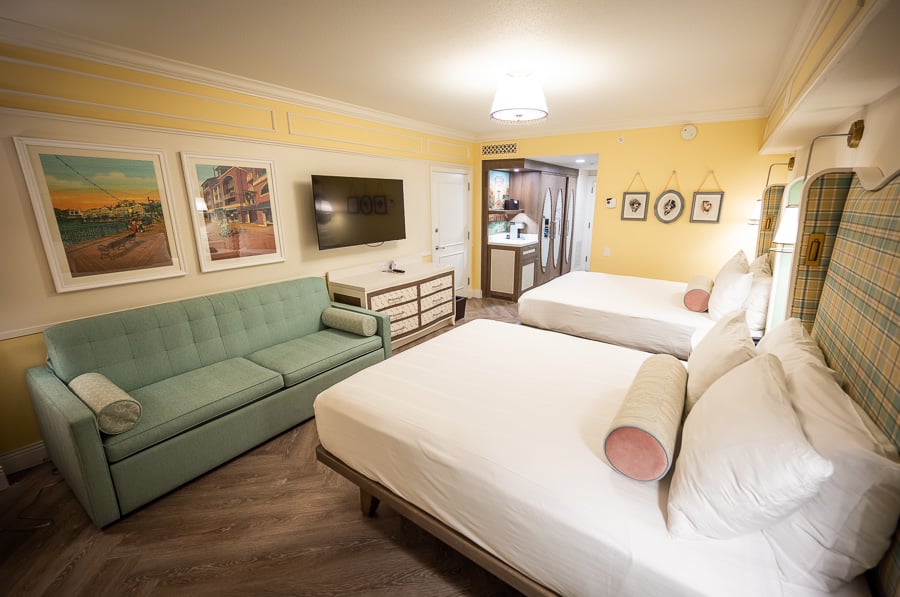

To continue this thread, one common complaint we hear about modernized rooms at Walt Disney World is that they are “sterile” or “look like a hospital.”
When it comes to the Value Resorts or even some of the Moderates (or Deluxes done 5+ years ago), this critique is very fair. There’s an abundance of white and the lighting is bright. However, we still hear this criticism of the newer Deluxe Resorts and at this point it honestly is starting to feel a little lazy.
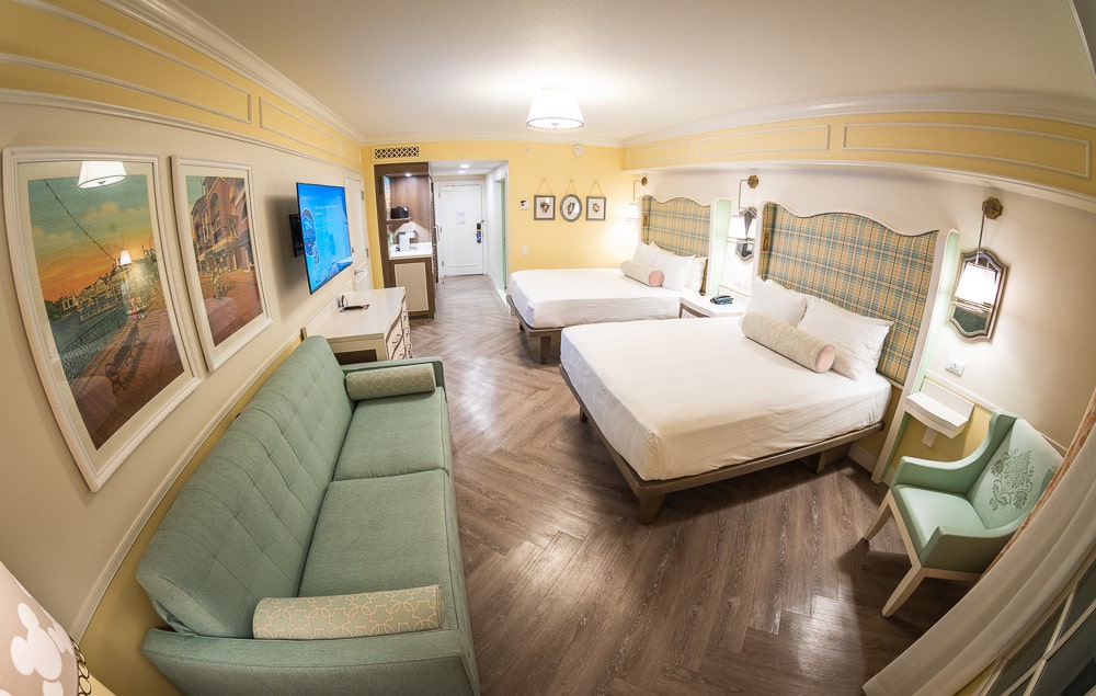

Like or dislike these rooms, we don’t really care. Just offer more than blanket buzzword critique that doesn’t really apply. Heck, I’d rather hear people say that they don’t have the same sentimentality or nostalgia for these rooms as the old one. At least that’s sincere and heartfelt.
Point being, if you look around the new BoardWalk Inn rooms at all, there’s a lot of visual interest. The aforementioned art, the custom furniture, furnishings, and fixtures. We haven’t discussed it yet, but there’s ornamental wainscoting, trim, and yellow/cream paint. It’s not simply bare and white walls. (I would’ve loved to see some of the old wallpaper retained; it’s coming back in style and was perfect!)
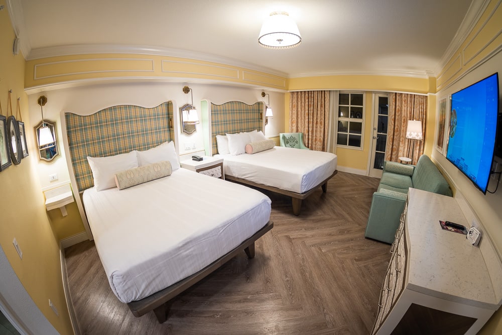

I mention all of this because I really like the new rooms at Disney’s BoardWalk Inn, but must admit that there’s something about these that doesn’t completely “click” for me. Admittedly, if this were ~5 years ago, I’d be over the moon with these–they’re a huge improvement over the last generation of generic and dull new rooms. During that time, though, Walt Disney World and Imagineering have gotten a lot better at threading the needle (especially, in my opinion, with the new DVC villas).
For me, I think that can be distilled into these rooms being luxurious and chic rather than charming and whimsical. For the most part, these new rooms are great. They’re themed well. They look nice, stylish, and fresh. They offer functional improvements and overdue modernizations. I would hazard a guess that 95% of Walt Disney World first-timers will rate these higher than the old rooms.

It’s important to give these guests what they want and a caliber of quality that comports with the $500+ price points. (I think many fans underestimate just how often Disney gets complaints about “dated” guest rooms.) Balancing theme and luxury, especially with a style based on turn-of-the-century Atlantic City isn’t easy!
It also isn’t easy to cater to both first-time guests and repeat visitors who have been visiting Walt Disney World for decades. The two groups often want different things, and the latter can be difficult to please. Against that backdrop, we rate these new rooms at BoardWalk Inn very highly. They’re as adept at juggling two competing concepts as the promenade performers outside. But when it comes down to our own nostalgia or sentimentality, they just don’t quite have the same quirky charm as the old rooms.

I’m very aware that this is a “me problem.” Nevertheless, I feel like I’ve been slowly watching an erosion of the eccentricity and charm that made Disney’s BoardWalk Inn distinctly Disney. Or at least, that quintessential 1990s Walt Disney World. The creepy clown pool. The comfy quality of Belle Vue Lounge. The stark contrast of Carousel Coffee. At least we still have the children of the corn chairs and elephants in the lobby!
All of these are little things in isolation, and guest feedback can explain every single one of the changes. Yet, for a longtime Walt Disney World fan, it’s a little sad to one of Walt Disney World’s best-themed resorts lose a bit of its charm and character. Frankly, I don’t even think it’s entirely fair to lump these rooms in with all of the above, as these are still really good even to me, and will move the needle tremendously for average guests (whereas I think everything else on the list was fixing things that weren’t broken).
Still, I figured this was worth sharing as it kind of cuts to the tension between my own nostalgia and my objective view of the new rooms at Disney’s BoardWalk Inn. If I had zero history with this hotel and had to pick between the new and old rooms, I’ve gotta believe I’m picking the new ones, hands down. The thing is, though, that I do have a history and find myself missing elements of those old rooms and their unique personality. These new rooms are quite good, but for me, they don’t have that same heart. Or least, they don’t yet. Get back to me in a decade when they’re slated for replacement and maybe I’ll be waxing poetic about my sentimentality and nostalgia for the now-new, then-old rooms at Disney’s BoardWalk Inn.
If you’re planning a WDW trip, we can help! For where to eat, read our Walt Disney World Restaurant Reviews. To save money on tickets or determine which type to buy, read our Tips for Saving Money on Walt Disney World Tickets post. Our What to Pack for Disney Trips post takes a unique look at clever items to take. For what to do and when to do it, our Walt Disney World Ride Guides will help. For comprehensive advice, the best place to start is our Walt Disney World Trip Planning Guide for everything you need to know!
YOUR THOUGHTS
What do you think of the newly-reimagined rooms at Disney’s BoardWalk Inn? What do you think of the new artwork? What about the other furnishings, fixtures, or decor? Think this does a good job of balancing theme and luxury? Any specific details or elements you like or dislike? Do you agree or disagree with our review? Do you prefer the look of the old or new rooms? Any questions we can help you answer? Hearing your feedback–even when you disagree with us–is both interesting to us and helpful to other readers, so please share your thoughts below in the comments!

