Summary
- Air Canada, known as TCA from 1937-1965, saw livery changes, reflecting Canada’s flag colors.
- After its privatization in 1988, the airline ditched the cheatline for a simple white fuselage look.
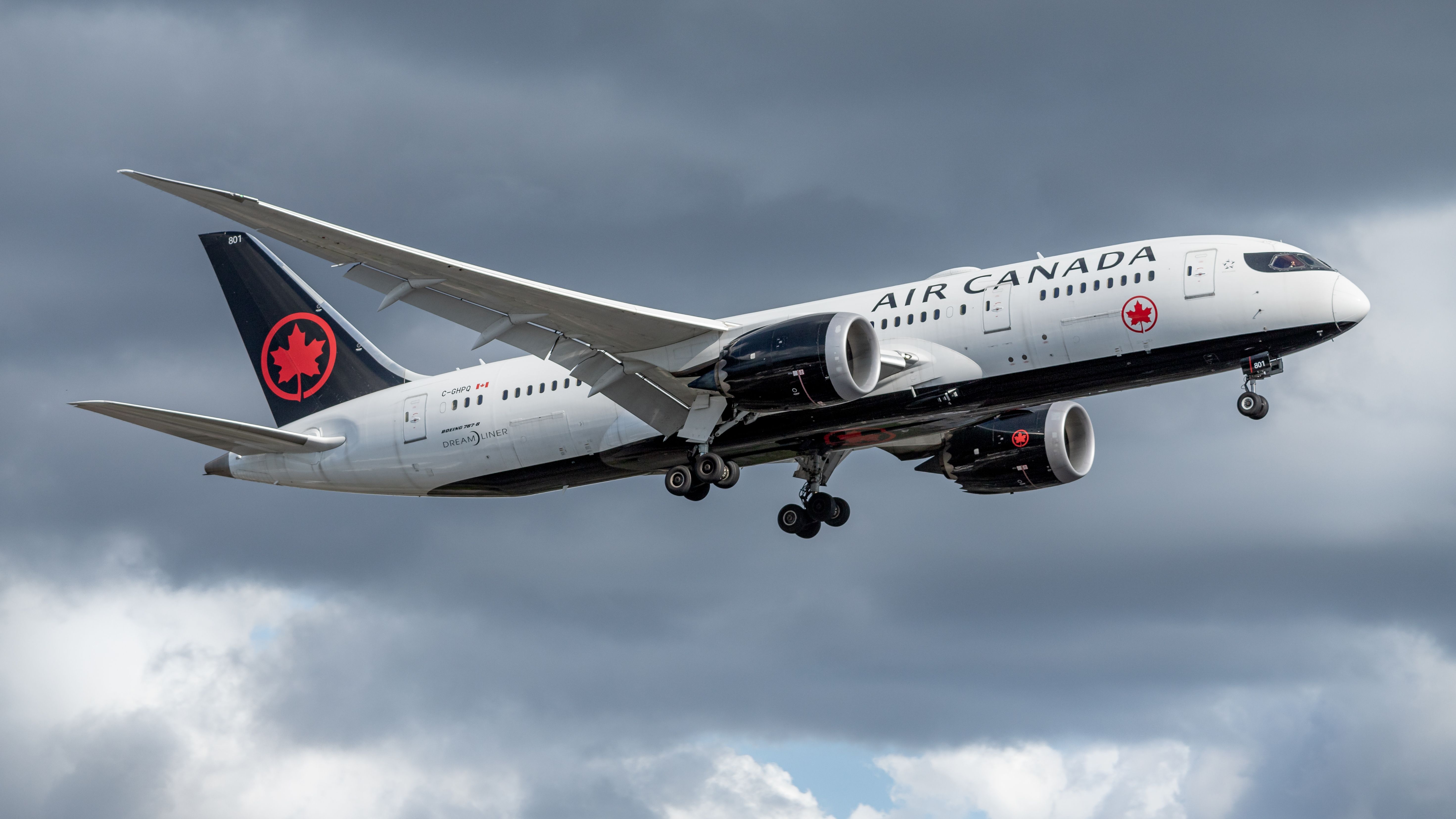
- The carrier’s current livery, reminiscent of the 1990s style, features a bold maple leaf on the tail and a unique cockpit mask design.
The national flag carrier of Canada was founded in April 1937 as Trans-Canada Air Lines (TCA). Following government approval in 1965, TCA was renamed Air Canada and was privatized in 1988 after the deregulation of the Canadian airline market. Air Canada acquired its biggest rival, Canadian Airlines, in 2000.
With nearly 87 years of history, Air Canada has gone through one name change and several livery revisions. This article explores how the airline’s livery and styling have changed over time. Notably, we will only include the carrier’s mainline fleet while excluding the aircraft of its regional subsidiaries. Moreover, Air Canada’s special one-off liveries or low-cost brands, whether its historical subsidiaries Zip and Tango or its current budget brand, Rouge, are excluded.
TCA: From inception to the 1960s
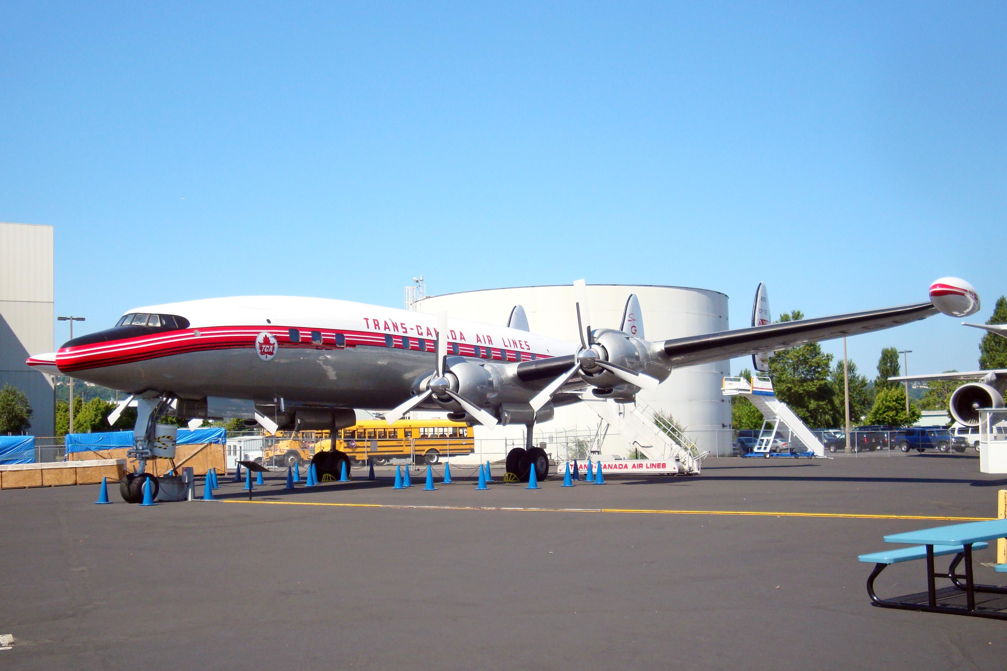
Starting its service as a government-run carrier, Air Canada first started as Trans-Canada Air Lines, or TCA. During those first decades, the airline had a largely bare metal appearance for its aircraft, which was relatively standard then. This was accented with red and white cheatlines along the fuselage, with the wording “Trans-Canada Air Lines” above in red letters.
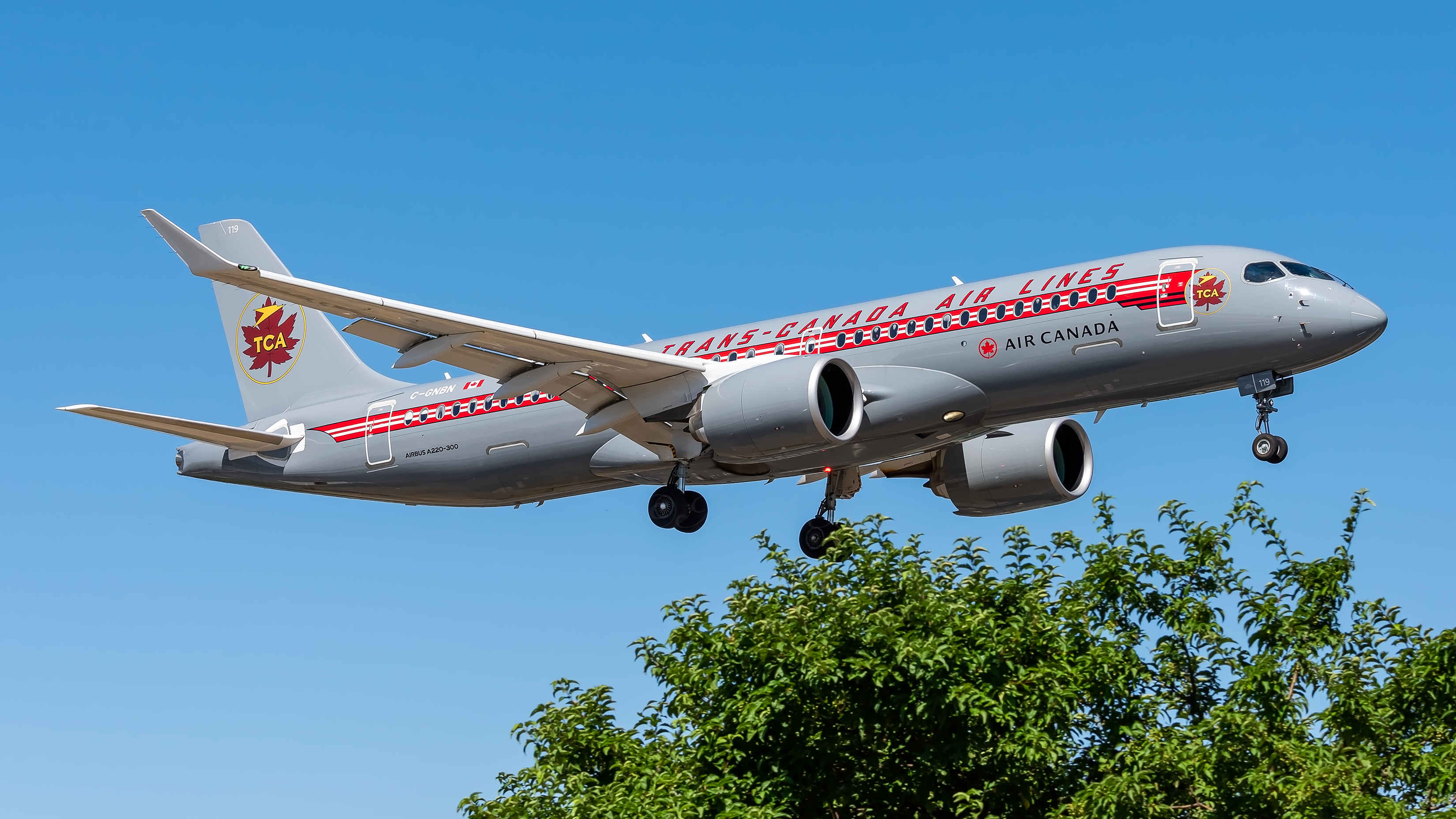
There was a slight variation in the appearance later on, as some of TCA’s aircraft began to feature a white top with a bare grey-metal belly. Air Canada also revived the look of its early TCA days with a retro livery on one of its Airbus A220-300s (shown below, 2nd image).
Officially Air Canada: 1960s to 1990s
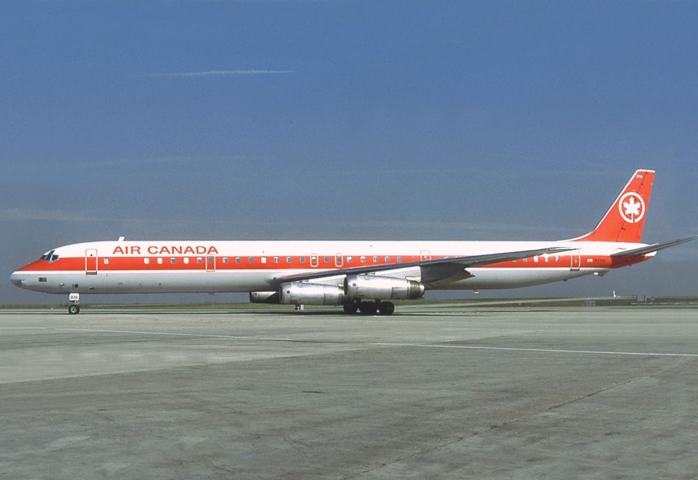
Officially renamed Air Canada in 1965, the airline would certainly need to change at least part of its livery to reflect the new identity. However, it went a step further and radically altered the livery fleet-wide.
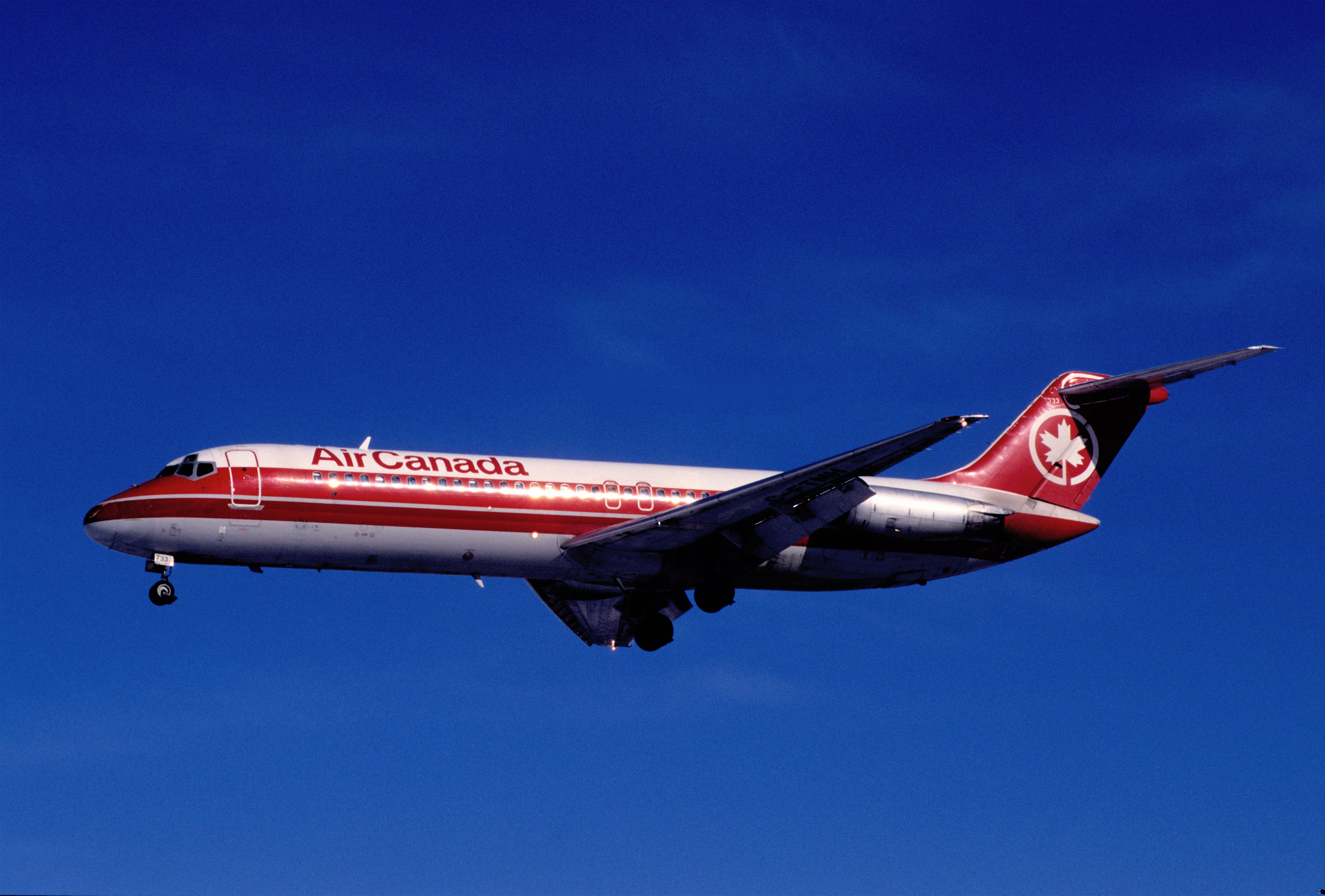
During this time, Air Canada’s aircraft would take a bright red and white to reflect the colors of the nation’s flag, reasonably appropriate considering the airline’s status as a state-owned entity up until the late 80s.
Luxury: Inside Air Canada’s Private Jet Brand
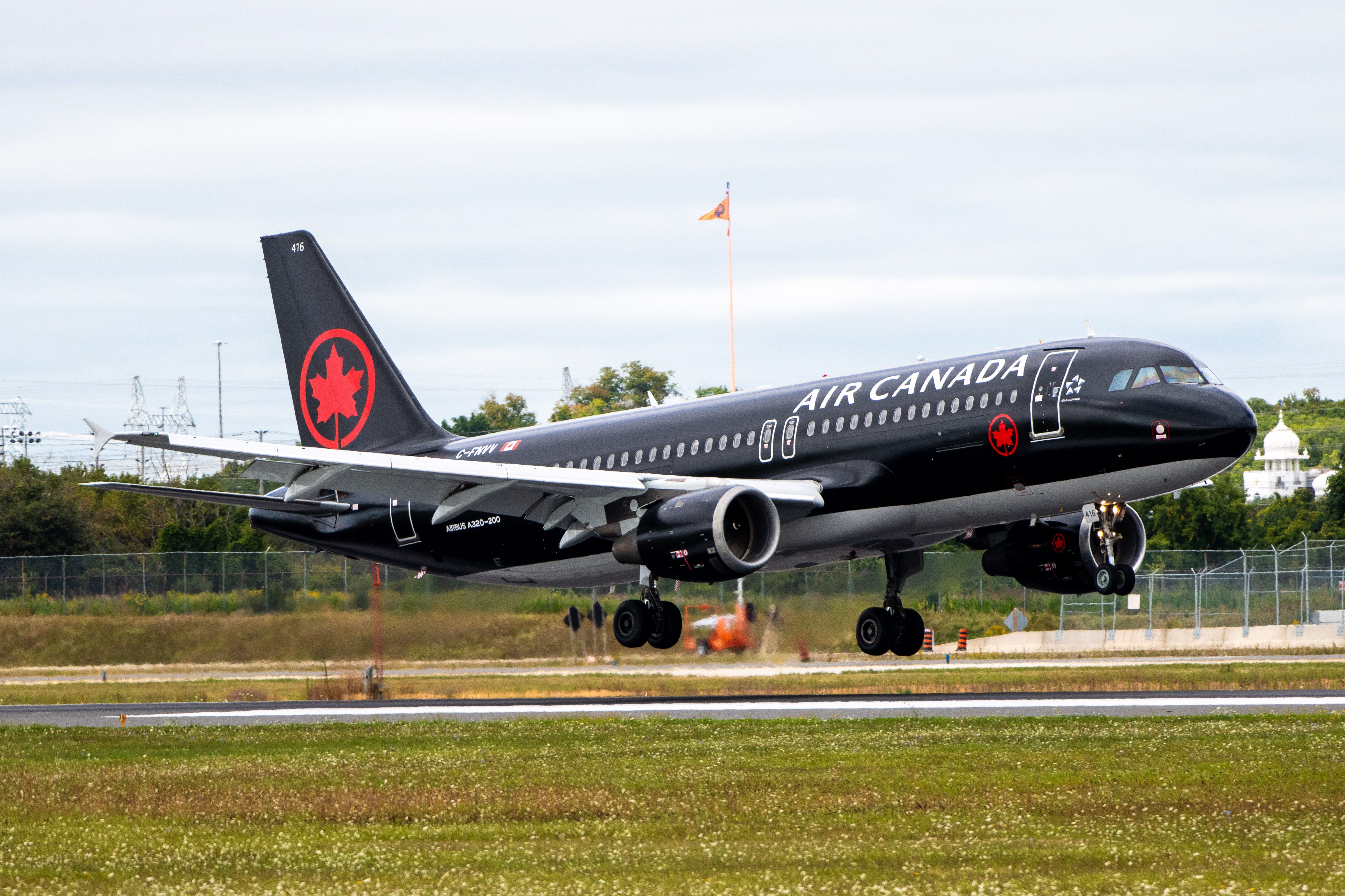
Air Canada Jetz presently operates four specially configured Airbus A320s.
The eye-catching red was introduced along with the airline’s new logo- a maple leaf ’roundel’ (which is defined as a small disc used for a symbol, such as a decorative medallion). Other famous roundels you may have encountered include the blue, white, and red roundel of the UK’s Royal Air Force or even just the logos of the London Underground and its various lines.
The cheatline-look was maintained, as it remained common in the industry throughout this period.
The early-mid 90s would see a slight variation on the red and white cheatline, with Air Canada darkening the red on the tail and adding a darker red band across the fuselage. The aircraft bellies would also take on a light grey tone.
Stay informed:
Sign up
for our daily and weekly aviation news digests.
Ditching the cheatline: The 1990s to the early 2000s
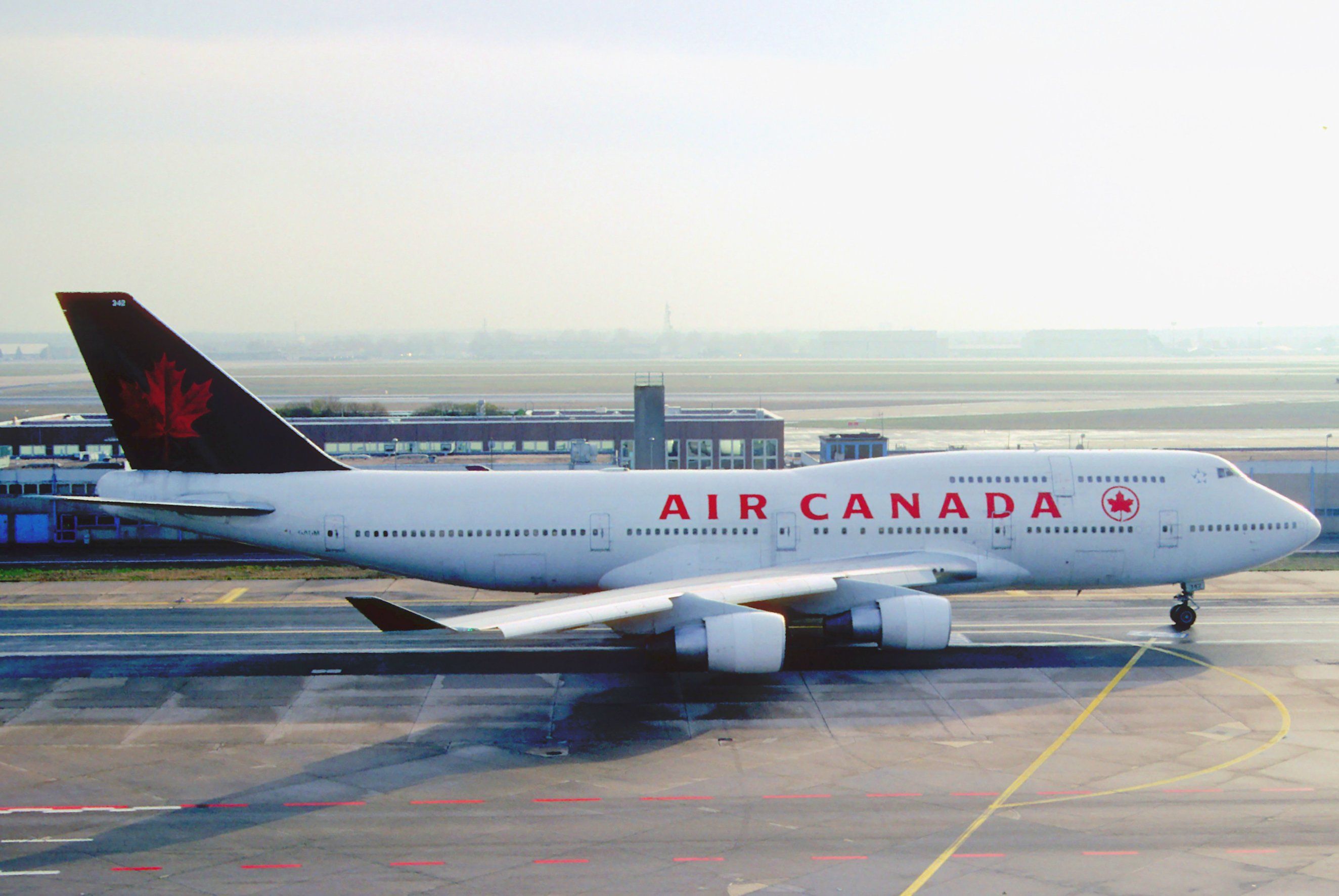
With Air Canada’s privatization in 1988, the carrier decided to change its livery yet again to reflect its new identity. This period saw the airline ditch the cheatline and go with a relatively simple look in the form of a mostly-white fuselage. A more detailed maple leaf replaced the roundel on the tail, while the Air Canada wordmark on the side of the fuselage was refreshed, with the roundel making an appearance alongside it.
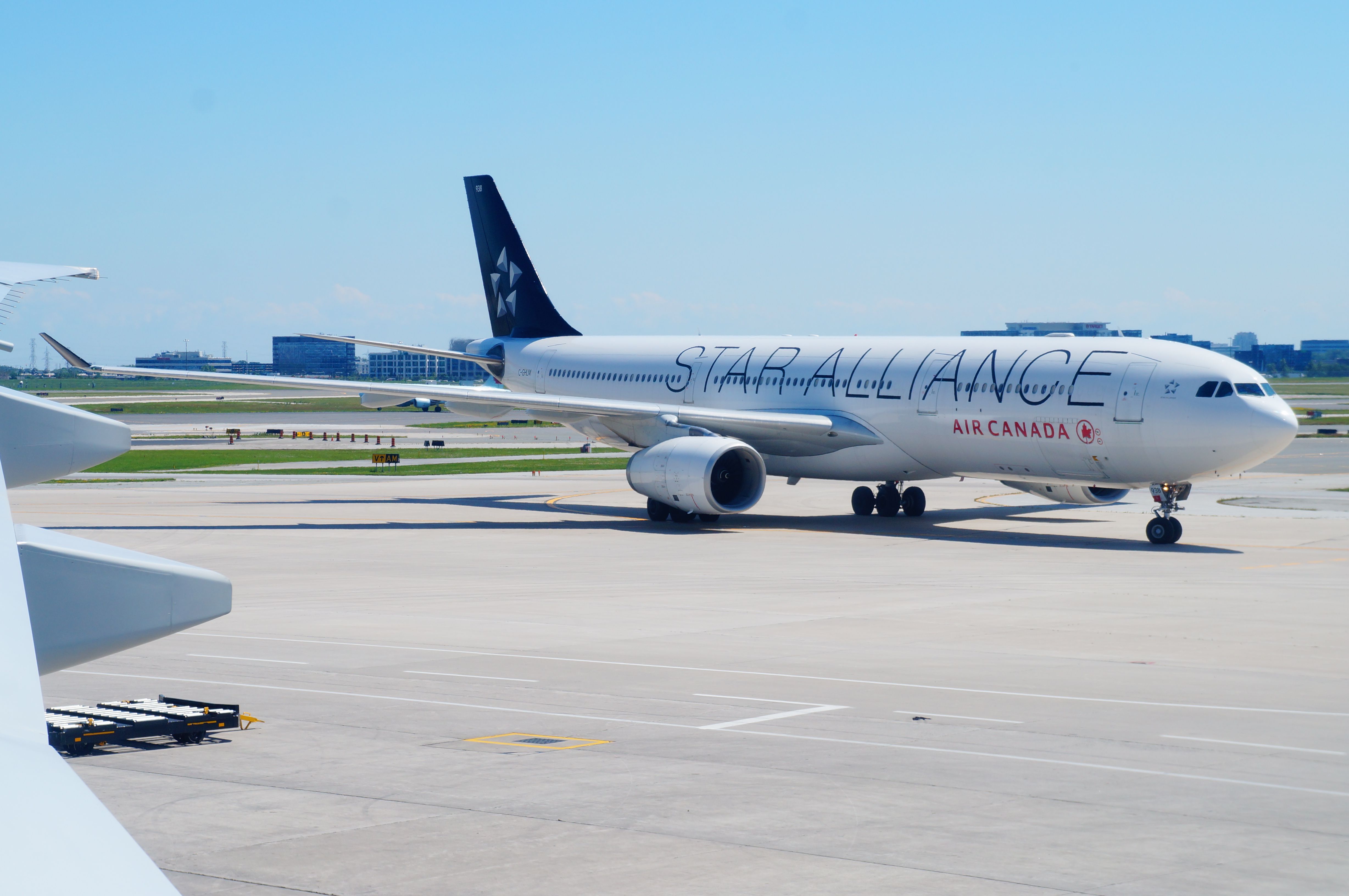
While we said we wouldn’t cover special liveries, it should be noted that Air Canada was a founding member of the Star Alliance and thus had one of its jets painted in a Star Alliance livery. As per the requirements of most alliances these days, Air Canada still maintains several aircraft in such a livery.
A radical shift: The 2000s to mid-2010s
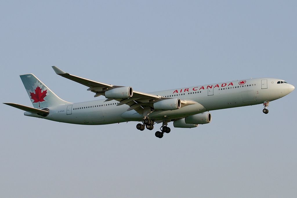
From around 2004 to 2016, Air Canada would go with a light turquoise fuselage color. With this look, the graphic maple leaf on the tail would stand out more easily. From the looks of it, the carrier also ‘beefed up’ its fuselage wordmark, making the words “Air Canada” and the roundel larger and thicker. The aircraft’s engines would take the same color as the fuselage.
Being the 2nd most recent livery, the airline still has some aircraft in this paint job.
Back to the future: Air Canada’s current livery
While it’s not exactly a full ‘retro livery,’ Air Canada’s current branding is a bit of a throwback to its 1990s look. The airline has gone back to white, red, and black with a few modern touches. Firstly, the roundel has returned to the tail. This big, bold, and red symbol sits against a black background. The new livery also has jets painted with a black belly, as well as black engines.
On the side of the fuselage, the Air Canada wordmark remains, but the roundel has been separated and now sits below the window line.
Photo: Philippe Godin | Shutterstock.
Perhaps the most striking feature of the carrier’s new livery is the ‘cockpit mask.’ This look is reminiscent of the cockpit outline of newer generation Airbus jets but takes things a little further with a bolder and larger outline.
But Air Canada’s cockpit outline has a unique style of its own, remaining somewhat flat across the top. The bottom black edge bends upwards to meet the top line on either side. But it isn’t just Air Canada that has gone for the cockpit mask. Many airlines have used this design feature to give their airplanes a fresh look.
Alaska-based Northern Pacific Airways has given its newly acquired but older aircraft a new look with the cockpit mask. In July 2021, Portuguese wet lease airline Hi Fly posted a video on YouTube showing off its latest aircraft- an Airbus A330 with a similar look. Germany’s Eurowings Discover has also given its older aircraft a cockpit outline.
What do you think of Air Canada’s liveries? Which one is your favorite? Let us know by leaving a comment.
